
Robin.co — Feature Request
Background
Robin Healthcare is a company that provides AI-powered medical scribe service to help healthcare providers streamline their documentation workflows.
The SaaS model includes a mobile app that allows physicians to review and edit their notes. It’s used in tandem with the web software to capture and process patient data.
USER INTERFACE DESIGN
USER EXPERIENCE DESIGN
USER RESEARCH
CROSS-FUNCTIONAL COLLABORATION
Team
Senior UX Designer — Trina Tuazon
UX Researcher — Lucy Jiang
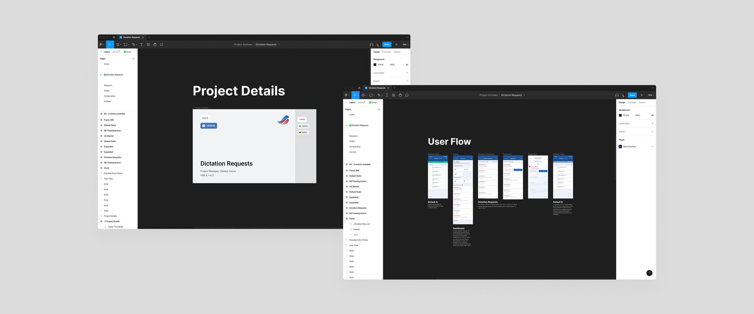
Project Manager — Haneya Yunus
Software Engineers — Mike Portanova, JC
Note: Designs are limited to the use of the existing Robin Library and Material UI Library.

Problem
Scribes frequently flag patient encounters as “unable to complete” due to missing data. Currently, there is no way for scribes to communicate directly with providers when additional information is required. A game of email telephone (scribe - chief scribe - provider - chief scribe - scribe) is played in order to obtain a missing dictation.
In the last 30 days, 10-18% of encounters were marked unable to complete due to missing dictations.
Hypothesis
The Robin App “Dictation Requests” feature will help providers who want to be aware of completion blockers by surfacing these dictation requests directly on the app to unblock scribe’s workflows. The app “dictation request” feature will also help scribes who want to collect all essential information to complete these medical notes as quickly and accurately as possible.
Perhaps we can minimize notification fatigue and demonstrate Robin’s value by showing providers a summary.
How will we know when we’re successful?
Metric Category #1
Metric: Decreased weekly un-billed charges
Target: < 5% of encounters missing data in the last 30 days
Metric Category #2
Metric: Time to complete dictation
Target: 80% of providers fulfill their missing dictation requests within 24 hours of receiving the request
What do we know about our Physicians?
The most important detail to note within our findings: Physicians are facing high levels of burnout due to increasing documentation needs. From the documentation burden to high inbox message volumes, Physicians are reluctant to adopting new technologies.
This means we have to be extremely tactful in how we introduce a new feature within the Robin App.

Wireframes
As a team, we spent a few days defining the problem space. This meant creating wireframes, identifying edge cases, going over existing UX Research results, and referring back to our provider persona documents.
We eventually established a game plan using the User Story Map framework. In three design sprints (roughly 6 weeks), we will design a new feature and test it within our own Robin network.
Design
In order to communicate the interface design and functionality of our product, I created mid-fidelity wireframes to provide a visual representation that can serve as a blueprint for development and user testing. So — using new and existing knowledge that emerged from our Product Development Roadmap, I got started.
When designing a digital product, exploring and iterating on multiple (and I mean multiple) design options can help to identify the most effective and user-friendly solution.

Cross-functional Collaboration
After coming together with the team, we identified several topics for discussion centered around core components of the design.
A larger question was faced as a team was — Do we surface user metrics? Our main goal for this feature was to highlight the value proposition of using Robin while we integrate Dictation Request in the least invasive way possible. Metrics allow us show positive metrics to support the idea of Robin’s value proposition. On the other side of the coin, it does expose negative metrics. Exposing metrics also provides a positive contrast to the list of request we’re asking from Physicians.
Metrics
Do we favor the route that’s easiest to implement? Or do we go with the route that pushes the boundaries of our scope with the potential of adding value to our users? The route that’s easiest to implement minimizes the learning curve as we leverage existing components. The tradeoff is that providers don’t have the ability to view their congregated dictation requests within one page.
Implementation
Do we surface the new feature behind a button? Or do we expose it on a Dashboard-like landing page?
Clickability

At the end of our last sprint…
While our end design looked closest to our second option, we incorporated a lot of different elements from the others to marry a close to perfect MVP of this feature. Some major changes include: eliminating trends in metrics, removing icons to lessen confusion with unfamiliar imagery, and changes to the Dictation Request cards to stray away from the UI used in the scheduling feature.
What’s Next for Robin?
Currently, Robin is working on improving current web-based and mobile-based products. The steps following this sprint includes a lot of testing and hopefully more iterations to further improve this new feature. What does this look like exactly?
Hand-off. These designs will be directly handed to our engineers. Luckily, our team does not work in silos. Designers, developers, project managers, and other stakeholders are involved in weekly meetings through every step of the design process.
Lots of testing. Our UX Researcher (Hi, Lucy!) will review the data from the beta version of the new feature that will be tested with a small group of providers to validate the request process.
More designs! This feature can’t work on its own. In the next sprint, I’ll be working towards building the feature on the web application that supports communication between scribes and Physicians.
Looking back at the last few sprints, the biggest lesson I learned was the importance of testing. By iterating, shipping, and testing, you can identify and fix issues that impact product quality early. Testing allows us to refine our product incrementally using real-life, real-time data from our core users. Iterating and testing early and often can identify problems that can become more costly and difficult to fix in later stages of development.
This case study has been an incredible learning experience overall. Through iterative testing and design, I gained insights from our users that allowed me to make more intentional design choices. I am excited to see where the product goes from here and to continue using the lessons learned along the way to inform future design decisions.